The Connected Parent, a web-based SaaS platform that helps families find and review disability, autism, and mental health resources with ease and confidence. This early-stage SaaS startup needed to improve usability and accessibility across its platform, balancing speed-to-market with user trust.
Lead designer
Visual designer
Prototype
Design system
Engineer
Product manager
13 months
Writing reviews and creating accounts are confusing and frustrating
Searching is not intuitive and could benefit from clear filter options.
The existing color palette fails WCAG guidelines in several areas and requires an overhaul.
Results from survey conducted with parents and caregivers navigating disability and autism resources.
I mapped the existing screens to identify any overflow or redundancies, and then devised a new sitemap. Defining this sitemap was incredibly beneficial because, aside from easing the flow throughout the site, it served as a roadmap for how to proceed with this huge overhaul. Having the client visualize the pages while we discussed priorities was a big help. Since most of the pages were either being completely redone or added/removed, looking at the existing site wasn't as beneficial as this approach for understanding our scope.
Redefined Sitemap
Wireframes were quickly created to review the priority of components and review new layouts. The focus was mostly placed were simplifying navigation, seeing where and how we could shift to a reusable component system. A large constraint in this phase, as well as through a lot of the design implementation, was the restricted search feature that required users to select keywords instead of typing them in. This impeded user experience and would be rectified in later developments.
Low-fidelity wireframes of the homepage
Low-fidelity wireframes of search results page
Mediumn-fidelity wireframes of search results
All styles were implemented into Figma for efficient and consistent designs. The accessibility updates proved to be an immense undertaking, as it required careful consideration of all existing marketing materials, emails, and other assets. The scope of the task involved ensuring that the new colors not only addressed accessibility concerns but also seamlessly integrated across their entire range of materials.
Through this collaborative process, the client and I worked together to refine the palette and found an outcome that exceeded the client's expectations.
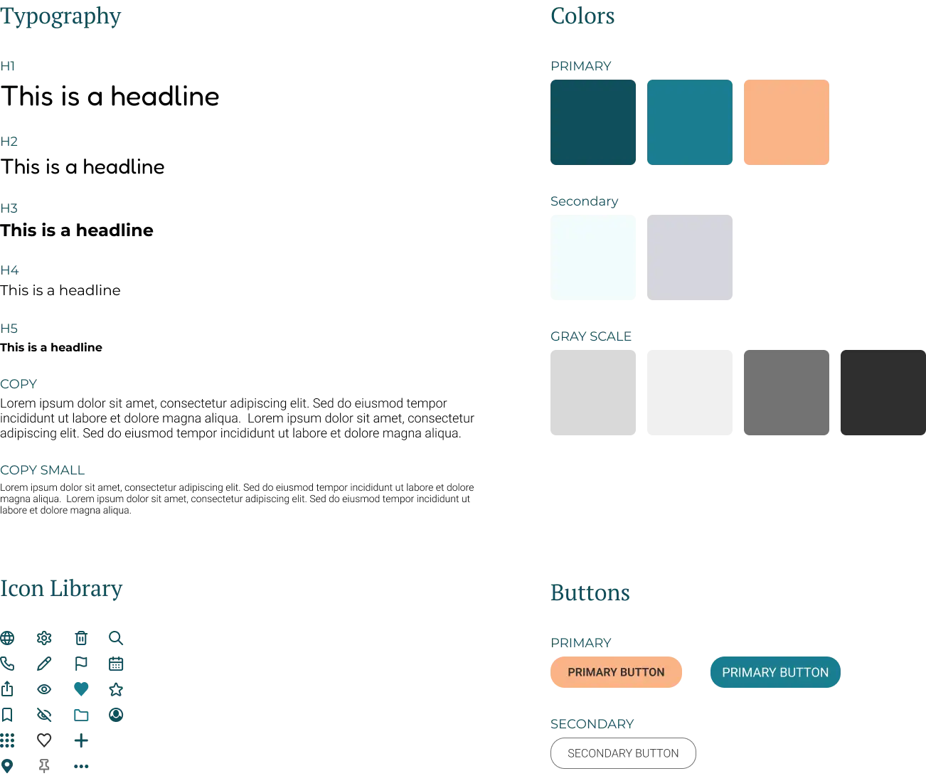
Figma Style Guide
We redesigned the home and search experience to help families find resources faster while reducing decision fatigue. Improved filtering and clearer information architecture made it easier to move from browsing to booking with confidence
Home screen
Resource Search screen
Event Search screen
Business pages were rebuilt to foreground credibility and social proof. Services, contact information, and community reviews now follow a hierarchy that answers parent questions immediately, while a simplified review flow encourages more families to share their experiences.
Business Page Screen
Business Page Review Screen
The event experience was designed for caregivers managing packed schedules who need information quickly. Clear details and streamlined actions make it easy to discover activities or contribute events without adding friction to already busy lives.
Event Screen
Add Event Screen
We created a user prtofile that helps families manage their activity while discovering how they connect to others with similar needs. Saved searches, reviews, and profile tools now live in one place, encouraging return visits and deeper platform engagement.
User Profile Overview Screen
User Profile Edit Screen
User Profile Reviews Screen
User Profile Searches Screen
User Profile Settings Screen
User Profile Events Screen
A business portal was built to help providers manage their presence with less administrative overhead. Streamlined listing tools and review management encourage active participation, strengthening the ecosystem for both businesses and the families who rely on them.
Business Portal screen
Business Portal businesses screen
Business Portal reviews screen
The redesign focused on clarity and trust rather, creating a tool that families could navigate with confidence. Every decision centered on improving usability and accessibility to ensure the experience felt intuitive, reliable, and supportive.
Designing this app held a deep personal significance for me because my brother-in-law has a disability in which he requires comprehensive
support in his daily life. Because of this, I have witnessed firsthand the challenges and obstacles involved in accessing disability resources,
particularly for adults. This drove my passion to assist the client in enhancing their existing website to better serve users.
Embarking on this project, I found great excitement in my client's enthusiastic approach. It became clear to me that prioritizing the user's needs
and ensuring the brand's identity aligned with its function were of utmost importance. Throughout the process, there were numerous obstacles,
such as determining the right colors for the brand, which required multiple discussions with the client. However, the end result is a design that
is inclusive and user-friendly, and it fills me with pride.
Looking ahead, the design has the potential to expand as additional features, including a social platform, are incorporated into the website.
I am eager to further refine and develop these ideas, building upon the foundation we have laid
he final design of The Connected Parent platform offers an enhanced user experience, improved accessibility, and a refined visual identity.
This project reinforced the importance of user-centered design principles in creating impactful digital solutions.