Challenges
New York Life Investments needed to improve the usability, consistency, and scalability of their website which is a large ecosystem with dozens of live pages maintained by multiple teams. I led UX/UI enhancements across key areas, including interactive tools, contact forms, layout templates, and documentation within the shared design system.
Goals
Create reusable, accessible components within the design system
Update key page templates for consistency and responsiveness
Improve user experience for forms, calculators, and content layouts
Support implementation using AEM modules and QA updates
Key UX/UI Enhancements
1. Investor Submission Form Redesign
2. Tax Calculator Interface
3. Page Template & Design System Updates
This case study explores a range of small projects that are part of ongoing site enhancements and modifications.
Enhancement 01
Investor Submission Form Redesign
The submission form was one of the most frequently used touchpoints for New York Life Investments' institutional clients. My goal was to improve the experience by streamlining the form fields, reducing friction, and aligning its interface with the broader design language of the site. Working closely with developers and compliance, I focused on creating a form that was both accessible and efficient—balancing regulatory requirements with an intuitive user flow.
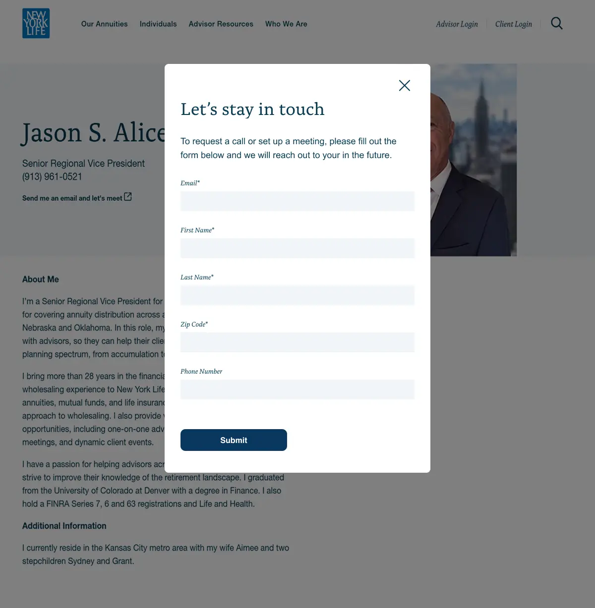
Initial form
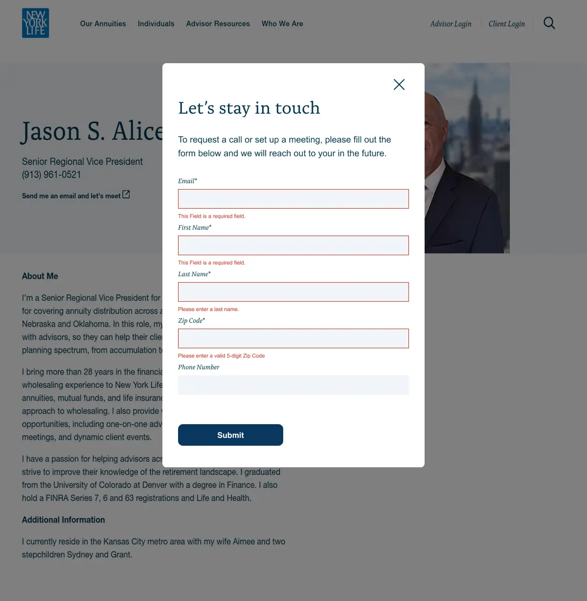
Form with error messages
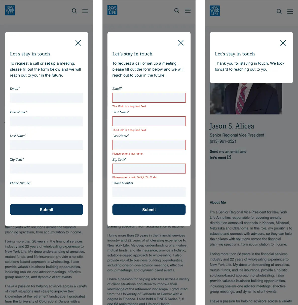
Form flows on mobile
The redesign prioritized accessibility and compliance without sacrificing usability. Form fields were reorganized into logical sections, inline validation was introduced to prevent errors before submission, and accessible labels ensured screen reader compatibility. Collaborating with the development team helped validate technical feasibility early, while design consistency with the site’s visual system reinforced user trust. The result was a smoother submission experience that reduced form abandonment and simplified future updates across similar templates.
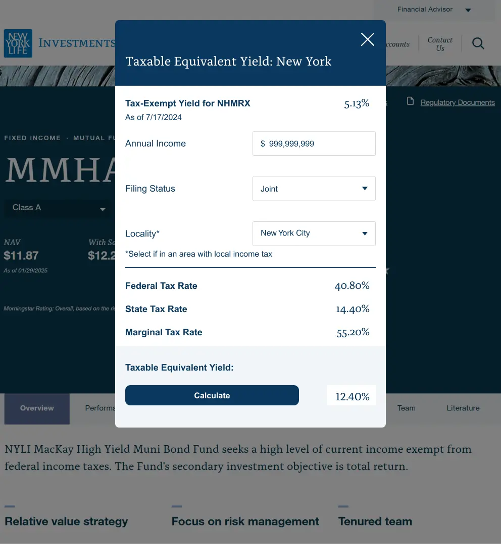
Enhancement 02
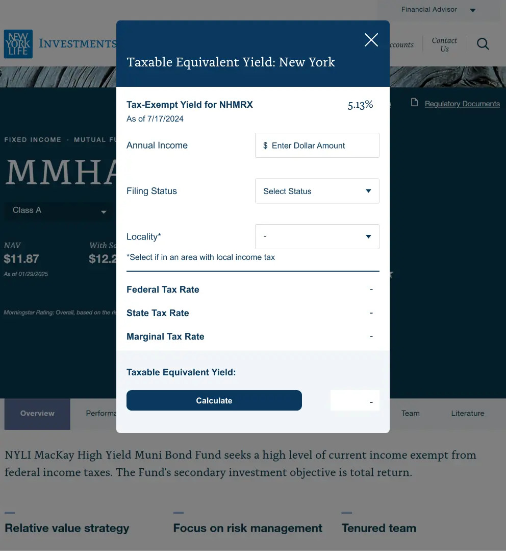
Tax Calculator Interface
The goal was to modernize the interface, improve usability, and ensure it aligned visually and structurally with the broader site ecosystem. Working alongside developers, I refined input behaviors, optimized mobile responsiveness, and introduced clearer data visualization to make results easier to interpret at a glance.
Default calculator
Calculator process
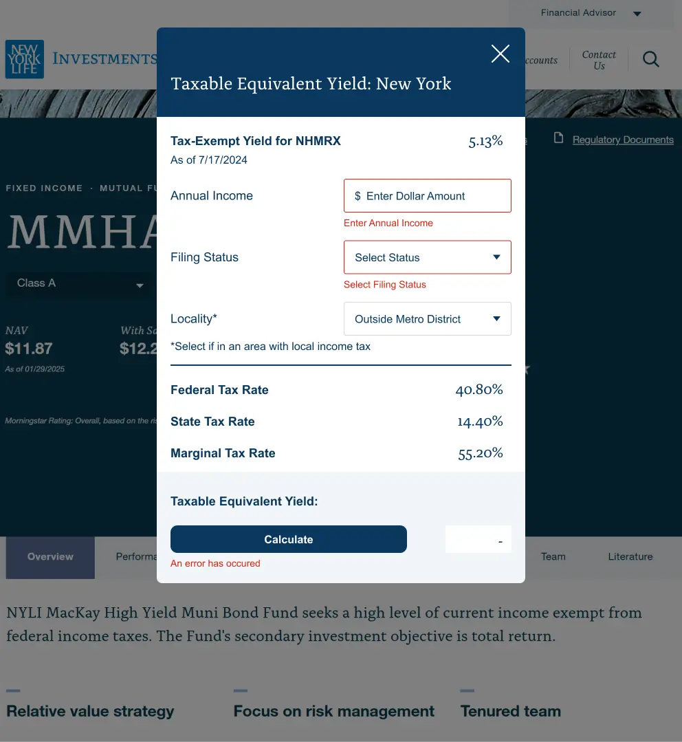
Error state
Enhancement 03
Reusable CMS Components and Design System
Beyond individual feature updates, I introduced UI refinements across multiple CMS modules used by authors daily to improve both user experience and operational efficiency.
- Standardized spacing, field alignment, and button hierarchy
- Consistent branding across charts, forms, and content tiles
- Flexible templates enabling faster content publishing
- Accessible color pairs and revised heading semantics
These refinements reduce fragmentation over time, creating a more unified and sustainable ecosystem.
Outcomes & Impact
- Reduced errors and user friction in high-value submission workflows
- Improved readability and comprehension of interactive financial tools
- Cohesive component styling increased trust and visual clarity
- Accessibility and mobile responsiveness uplifted key conversion flows
- Reusable templates accelerated content authoring at scale
This project strengthened my ability to deliver incremental, high-value improvements inside a large, regulated system. This work reinforced that enterprise UX isn’t always about full redesigns— it’s about moving the system forward one thoughtful improvement at a time. I learned how to: Balance user experience with compliance constraints Build components that scale across an entire enterprise Collaborate closely with authors, devs, and brand to ship reliably Refresh aging UI without disrupting existing workflows or templates It reinforced that small, continuous design improvements can have an outsized impact on enterprise ecosystems.