SupplyLogic is a marketing execution and supply chain solutions provider serving enterprise and mid-market organizations. The existing website struggled to clearly communicate the company’s offerings, value proposition, and credibility.
The goal of this redesign was to create a modern, structured, and scalable website that clarified what SupplyLogic does, who it serves, and how its services work together.
UX / UI Designer
Designer (me)
Development team
~2 months
SupplyLogic engaged our team to redesign their marketing website as part of a broader brand refresh. The existing site struggled to clearly explain what the company did, who it served, and how its services fit together, particularly for enterprise audiences evaluating multiple vendors.
The project required balancing clarity with credibility. SupplyLogic offers complex, operationally critical services, so the site needed to feel structured, confident, and intentional without becoming dense or overwhelming.
The work focused on three core areas:
SupplyLogic already had a clear sense of where the business was headed, but the website hadn’t kept pace with that evolution. Content had grown organically over time, resulting in overlapping messaging, inconsistent hierarchy, and pages that required too much effort to parse.
I started with a lightweight audit of the existing site by reviewing page structure, navigation, and content flow. In tandem with this workflow were stakeholder conversations to understand sales priorities and common client questions.
From there, I established a set of layout and typographic rules that prioritized spacing, consistency, and readability. This foundation allowed design decisions to stay focused on communication rather than visual novelty, and ensured future updates could be made without reworking the entire system.
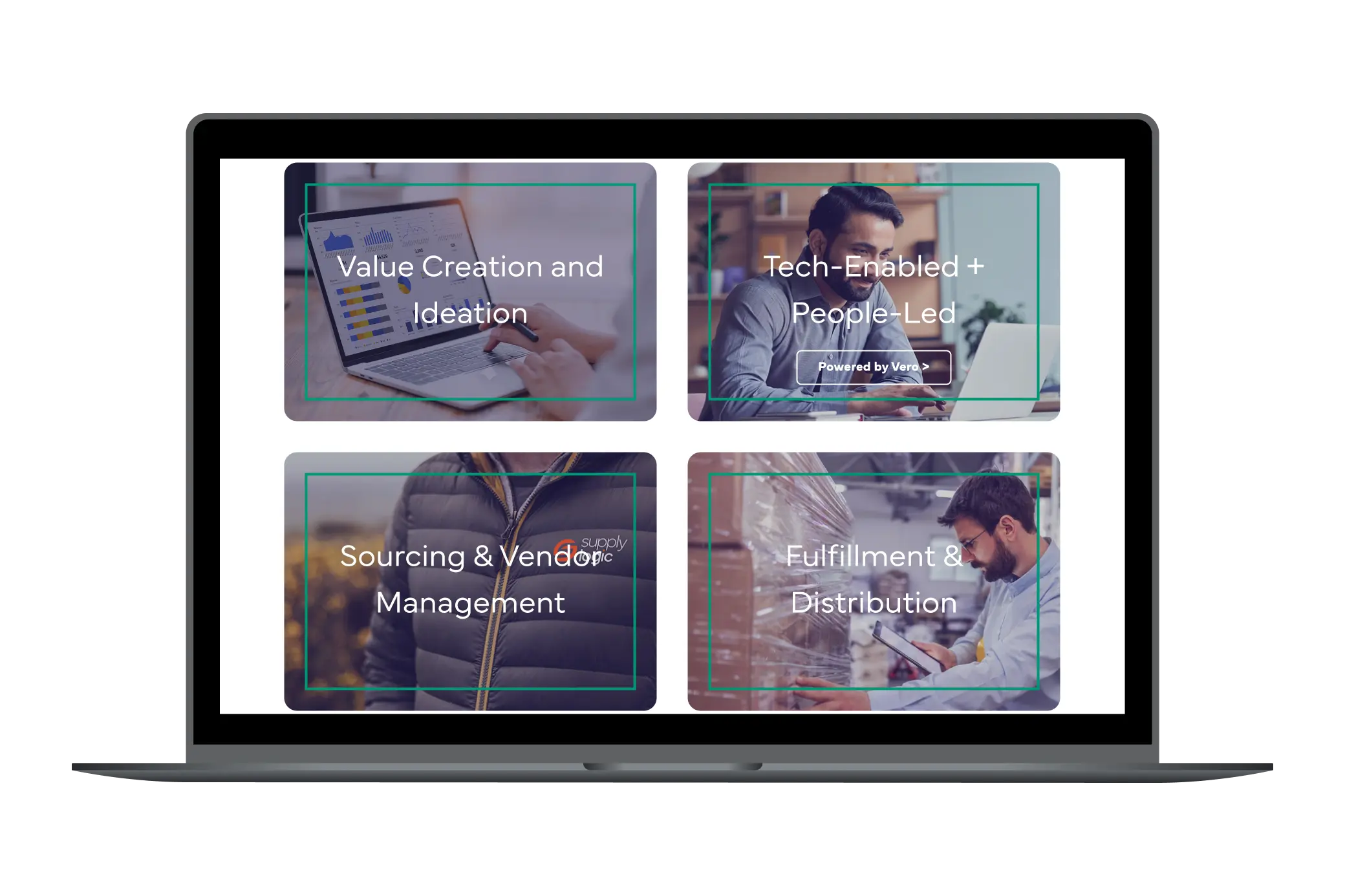
SupplyLogic’s audience includes operations leaders, procurement teams, and enterprise stakeholders users who value clarity, efficiency, and confidence over marketing language or decorative interaction.
The design approach focused on restraint. Instead of relying on heavy visuals or animation, hierarchy, spacing, and alignment were used to guide users through the content and reinforce credibility.
Small details such as consistent section rhythm, predictable layouts, and clear page-to-page patterns help users quickly orient themselves and understand how different services connect.
Homepage
What We Do
Who We Are
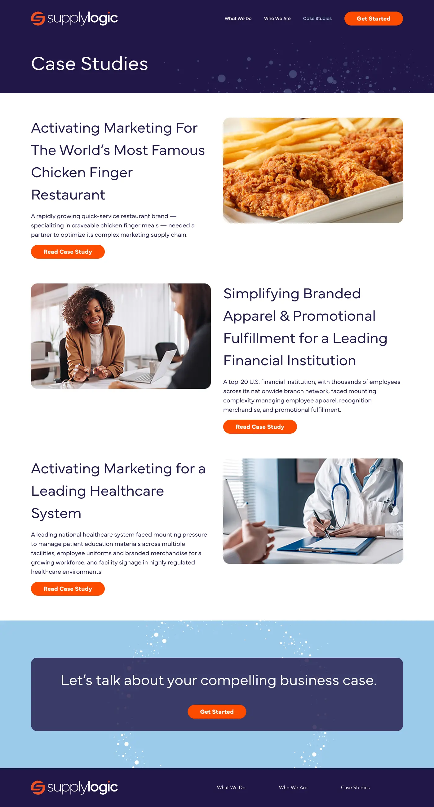
Case Studies
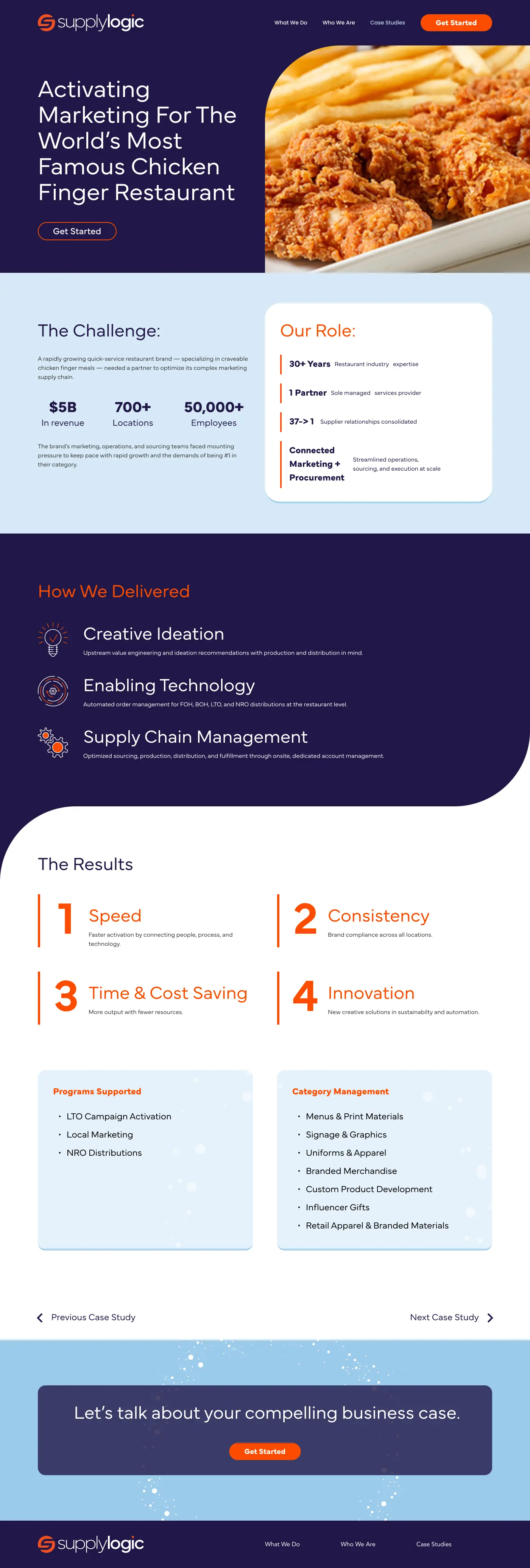
Sample Case Study
A high-fidelity prototype was created to validate layout decisions, responsive behavior, and content hierarchy before development.
This project reinforced that effective B2B design prioritizes clarity over decoration. When services are complex, the interface should feel calm, structured, and intentional.
By focusing on hierarchy, spacing, and content strategy, the redesign improves usability and perception without relying on heavy interaction or visual noise.